Project Overview
Gro-Op is a fully-interactive clickable prototype built around the idea of connecting health and community-minded individuals with local urban farmers and gardeners in their vicinity. Sharing locally-grown produce, either through sales or trade, is the main idea behind the app. Currently called Gro-Op, a combination of “grow” and co-op,” and was a result of wanting to have a brandable, approachable name to build the concept around. The name may change, but the idea of growing a cooperative community will remain.
Research
If there isn’t a need for this product, it will going to be an uphill climb when it comes to developing it, so I started with some guerrilla research. I spoke with a few people who were avid farmer’s market shoppers, and asked them if they would be interested in using an app that allowed them access to fresh fruits, vegetables and eggs in their community.


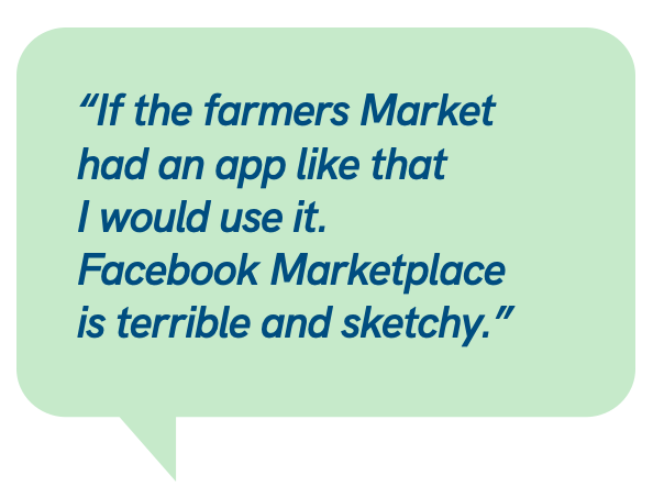
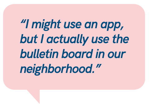
One person mentioned that they have tried using Facebook Marketplace to find local produce in season, but the experience was “terrible”. Facebook just kind of “got in my way.” Another person was open to the idea, and said they use a bulletin board in the common area of their neighborhood to see who’s selling or giving away extra citrus, apples, etc. They prefer the low-tech method since they “knew most of the people on there.
But that was enough to get the ball rolling. I started by designing a protopersona.

Proto Persona
Because she isn’t built off of a collection of actual interviews, I created a proto-persona to help keep the focus on the shoppers needs. From there, I built out a more fully-developed persona, and using her needs and community-minded profile, created a set of tasks that became a user flow. Then, finally, the building of the clickable prototype began.

Journey Map
Mapping Teresa's Journey Map came next.

I started out by creating a journey map, to give me a good look at how Theresa is going to hear about the app and potential touchpoint that may help or hinder the decision to use the app. One such pain point was the need to add a credit card to an app she just downloaded; this gave way to the idea to just hook up existing forms of payment that are likely already on her phone.
User Flows

Taking the next step to really drill down what that first-time user experience is like, and you can see the first iterations of what those screens could look like.
Low Fidelity Prototype

Finally, we’re jumping into visuals! Low-Fi paper prototyping was first, and we discovered that was a couple of issues with the flow, such as stopping to creating an account (to check out) made it difficult to get back to the user’s basket. This was fixed in the next iteration.

The high(er) fidelity clickable prototype was developed in Figma, with both a simple “happy path” and a more complex “just poke around and discover” plans.
There seemed to be a disconnect between buying items from two separate sellers and the act of picking the items up. The idea of buy online and pick up in person is great if buying multiple items from one store, but multiple “stores” served through one app creates a little bit of friction during the checkout process. Might be as easy as a notification that appears upon checkout “please note, you are buying items from multiple sellers” or similar.
Suggestions for the next iteration
- Logistics: when making a purchase from two different vendors, the app can handle distribution of funds, but picking up the orders is problematic.
Consider a TaskRabbit or other integration
- Security: when paying with cash in person, give the seller the opportunity to decline and request another form of payment.
(First time/guest purchaser with cash wasn’t as comfortable for the seller)
